
|
|
|
#511
 02-27-2021, 06:50 PM
|
||||
|
||||
|
To your first comment, I came to the same conclusion, although not as succinctly as you. I will try some shots with the screen filling the image, but in the past saw moire effects with Jpeg. Tiff seems to reduce or eliminate the effects. Not familiar with Nyquist. I’m not joking, you sound like a forensic color specialist. That’s a good thing for others to learn from.
As to your second comment, my applying noise reduction may have something to do with it. It seems to me that Tiff cleans the image of artifacts and such with wider dynamic range, but I also see increased grain. I know that noise reduction reduces details, tried to apply it in moderation. I used ISO 6400 which can add more noise. A true professional camera would be better. Thanks and heading over to the ETF virtual meeting in 10.
__________________


|
|
#512
02-27-2021, 08:15 PM
|
||||
|
||||
|
Nyquist Shannon sampling theorem: To convert an analog signal to a digital signal you need to sample the analog signal at atleast twice the frequency of the analog signal.
__________________
Tom C. Zenith: The quality stays in EVEN after the name falls off! What I want. --> http://www.videokarma.org/showpost.p...62&postcount=4
|
|
#513
02-27-2021, 08:59 PM
|
||||
|
||||
|
If possible, you should reduce the ISO to something much lower, say ISO200, pause the video, and use whatever time exposure is necessary.
|
|
#514
02-27-2021, 09:08 PM
|
||||
|
||||
|
Quote:
__________________
|
|
#515
02-27-2021, 09:18 PM
|
||||
|
||||
|
Quote:
I will adjust ISO.
__________________
|
| Audiokarma |
|
#516
03-03-2021, 02:33 PM
|
||||
|
||||
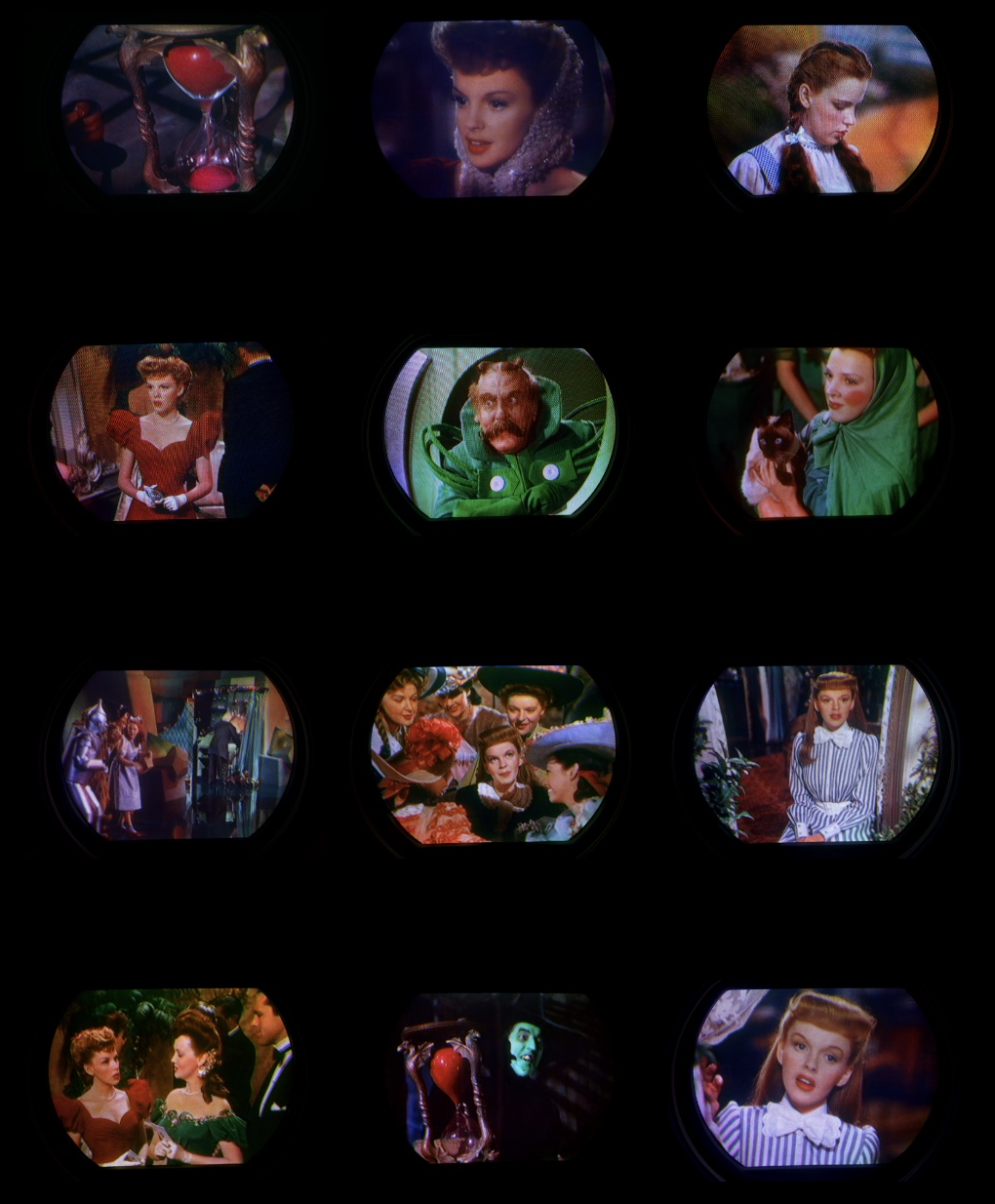 Evaluation of the Westinghouse H840CK15 with RCA 15GP22 image and color quality. Can we see extended greens and reds from the 1953 NTSC color phosphors offered by this CRT? This next test has the Sony A6300 set up for RAW quality, superior scene selection ( more sensitive light detection), ISO 250, aspect ratio 3:2 changed from 16:9, Adobe RGB, F/4.5, 25 mm, 1/20s. We used the same settings for all images. Set on a tripod, we filled the viewfinder with the screen image as best we could. I think you will notice the lower saturation levels compared to my usual screenshots. What Ive discovered with RAW is the increased dynamic range and detail. With the Affinity photo editor, its like calibrating a color television or monitor. We first tried to get the grey scale (the photo) right and hopefully everything else falls in place. Most of the editing was focused around the exposure, contrast and brightness settings. We tweaked black levels at times. We avoided picture enhancements. I like to say when first doing this RAW editing, its like when we got our first color TV. The tendency is to over saturate, but then I discovered how over saturation interacts with other colors and details. These photos reveals some of the weaknesss of this particular 15GP22. In most shots, there is a lighter band at the top of the screen. This is where Mike could not get the convergence perfect. You may notice a purity issue in the lower right corner and a portion of the left center at the edge of screen. In dark scenes (the witch and hour glass) there is a vertical faint band of light, center screen, top to bottom. Most of the time its not noticeable and low light. 86% of the light energy is blocked by the shadow mask. This test used DVDs of the Wizard Of Oz and Meet In St. Louis. We hope to refine our craft as we continue to learn with further evaluations, using different movies, particularly Technicolor 3 strip movies. Caution, very large files from 75 to 95 MBs. View on an extended color gamut monitor if possible. Newer iPads have P3 color gamut. TIFF 16 BIT RGB, P3 COLOR SPACE. https://visions4netjournal.com/wp-co...9074A781D.tiff https://visions4netjournal.com/wp-co...5ECC9E42D.tiff https://visions4netjournal.com/wp-co...7CCA5AD24.tiff https://visions4netjournal.com/wp-co...F9F184D93.tiff https://visions4netjournal.com/wp-co...E8F797821.tiff https://visions4netjournal.com/wp-co...C7A4F92AE.tiff https://visions4netjournal.com/wp-co...3F6DE0261.tiff https://visions4netjournal.com/wp-co...A92716187.tiff https://visions4netjournal.com/wp-co...DACE65D99.tiff https://visions4netjournal.com/wp-co...36D4CF92A.tiff https://visions4netjournal.com/wp-co...19CCBF55D.tiff https://visions4netjournal.com/wp-co...656F8F89D.tiff
__________________
|
|
#517
03-04-2021, 02:35 PM
|
||||
|
||||
|
I've had a little more time to look at some of these, and they look great.
They show a fact of life for photographing an image consisting of bright spots of light with dark spaces in between, and that is that the exposure must be set so that the bright spots don't get clipped. Since part of the image area is black, the average over an area is reduced. Therefore, an object like Judy Garland's white neck bow is represented as less than full white. (See https://visions4netjournal.com/wp-co...DACE65D99.tiff) There is no way around this when you are photographing the dot structure at full resolution. It does not look bad when the image is viewed by itself with no normally exposed image next to it on the same monitor; it's only like turning the monitor brightness down. If you want a brighter version, the only way is to reduce the resolution until the dots are smeared together (and also without moire' patterns), which would defeat the purpose of accurately depicting the full image quality.
|
|
#518
03-04-2021, 11:44 PM
|
||||
|
||||
|
My eyes were opened when I saw the results of Tiff photography and what a difference when dropping down to ISO 250. I tried to expose the neck bow better. It’s better then the Jpeg. You can see traces of transparent lace as well as the curtain. The smearing is gone.
Thanks for the tips. Since using Tiff, I won’t go back to Jpeg except casual shots.
__________________
|
|
#519
03-05-2021, 12:40 AM
|
||||
|
||||
|
Edit: I don’t see moire, but know it varies from screen to screen. In this latest round of shots, we brought the camera lens close to the television screen which seems to induce moire effect. Also noticed that auto focus was struggling at times because of the closeness to the screen. In future attempts, will pull back the lens and zoom in to fill viewfinder, and see what we get. Some of the shots look soft focused.
(I have “live view” with the camera and when I partially depress the shutter, I see tons of moire followed with the processed image available for about 2 seconds with the moire processed out and the flat Tiff image.)
__________________
|
|
#520
03-05-2021, 02:21 PM
|
||||
|
||||
|
I didn't mean that there is moire' in these shots, but that it can occur with some image resizing algorithms if you reduce the image size somewhat, but not to the point where the dots are completely smeared into an average value.
|
| Audiokarma |
|
#521
03-05-2021, 02:25 PM
|
||||
|
||||
|
The moire' on the live view is caused by a quick and dirty resizing algorithm to fit the back screen resolution.
I did notice that the focus is not perfectly even from top to bottom of the image on some shots. So, maybe the camera was not perfectly centered in front of the CRT?
|
|
#522
03-05-2021, 02:26 PM
|
||||
|
||||
|
Moving the camera back and zooming in will increase the depth of field and improve focus uniformity.
|
|
#523
03-05-2021, 04:53 PM
|
||||
|
||||
|
Quote:
__________________
|
|
#524
03-06-2021, 08:01 PM
|
||||
|
||||
|
Afyer I intalled "new" 15GP22 in my CT-100 I took many pictures. They should, at least
in color over large areas, look just like any other 15GP22 set. I apparently never posted them so I will here. They do look much like yours. On my calibrated monitor they look almost identicasl to the TV itself, as currently set up. "Currently set up" implies with the color level set using both "blue bars" from calibration DVDs an also all three of blue, red, and green bars from my own pngs played on my Blu-ray player from a USB key. These generate similar but not identical settings for the color control; I'm using the average. The hue control does not differ between the two. I've tried numerous different file formats and color gamut settings. These are Adobe RGB, but any wide gamut looks essentially the same. These are photographed with a Canon 7D using manual exposure and white balance. They are made with a 50mm lens which is defocused a bit to blur the triads just enough to make them overlap. In Photoshop they are further blurred using "box" blurring, then converted from 16 to 8 bits and cropped to be 900 pixels wide. No detail visible on the screen is lost, including convergence errors. There is a very mild amount of purity problem, essentially invisible on these highly saturated scenes. The biggest color error by far is that the blue bar on the color bars is too bright. Some of these pictures are at very close places in the Wizard of OZ as the ones of the Westy. I include dark scenes to show the low light performance. It really looks like that. I think the pictures are too saturated, but that's what the calibration says is right. http://www.videokarma.org/attachment...1&d=1615082275 http://www.videokarma.org/attachment...1&d=1615082275 http://www.videokarma.org/attachment...1&d=1615082275 http://www.videokarma.org/attachment...1&d=1615082275 http://www.videokarma.org/attachment...1&d=1615082275 http://www.videokarma.org/attachment...1&d=1615082378 Two more pics in next post. Doug McDonald
|
|
#525
03-06-2021, 08:03 PM
|
||||
|
||||
|
Last two of my CT-100 pics.
They do look equally saturated to the Westy ones. http://www.videokarma.org/attachment...1&d=1615082567 http://www.videokarma.org/attachment...1&d=1615082567 Doug McDonald
|
| Audiokarma |
 |
|
|


 Linear Mode

